Basic improvements to do with Photoshop
Never mind the risks I'm taking :P , I think I'll do some PS tutorials anyway to show just what I'm doing with my photos. Maybe it'll even help someone else. So here we have the before and after of the basic adjustments I do for almost every photo I upload. At times I do heavier shoppin, but even then I usually go through these few steps at first. I just might not do them to this extent, if I have to leave room for other effects.

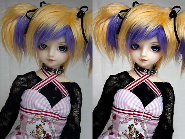
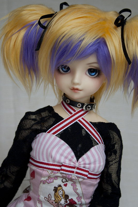
Here is where we start. I have only cropped the image to my liking and then resized it to the size all my current photos are saved at: 2100 x 3149 px (240px/in resolution, 2/3 relative size). Don't ask where I got that sizing :D I just usually end up with a photo larger than 2100 on the shorter side and then 2100 px just looked like a nice round number to use. For the photo itself I have used my camera's (Canon 1000D with kit lense) auto white setting and it was taken during a sunny day but with indirect light. I have also used an upwards pointing reflector and indirect flash to bring more light onto the face. Still, it is a bit bland for a photo, so lets spruce it up!
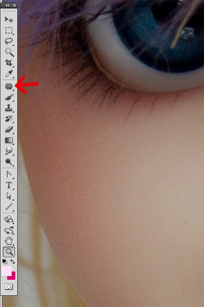
First up is clean-up. Others might use smudge to get rid of all the little annoying specs of dust or flyaway hairs that might be stuck on the face and might ruin the whole photo once you see it in full size. I personally prefer to use the Patch Tool, since it doesn't ruin the pixels like Smudge normally does. Patch is used by clicking the above marked icon.
Then draw a circle around the thing you want to erase to make a 'marching ants' edge around it. You might want to do this separately for each thing you want to erase. If you're erasing a hair that goes along the face, and over areas that have different colours (like on both lighted part of the face and on shadow), then erase the hair in separate portions to preserve the colour transition. Once you have your area selected, hold click over the area and draw it to a nearby, clean area. When you release, the spec is gone. Repeat for any other areas you want to fix. (Honestly, finding out about Patching has saved a lot of my photos that I just don't have the energy to shoot over again...)
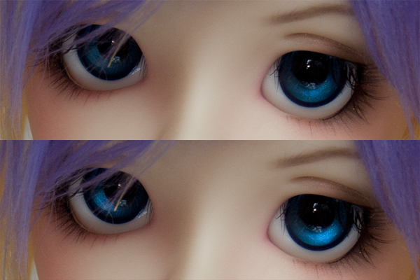
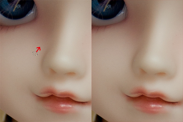
Then I brighten up the eyes using Dodge Tool. For settings I use Midtones and 20% exposure. Choose brush size to the size of the iris rim in the photo and hardness of 0%. I start by doing a large arc sweep along the bottom half of the iris. I then do shorter sweeps at the part where the iris is lighter by default and the even smaller sweeps at the very lightest spots. Don't overburn it though, even a light use of Dodge will make a difference and make the eyes pop.
This is what the photo looks like now. Better already, no? Still, the colours are a bit off, a bit too grey and greenish for my liking. So lets fix that and look at the multitude of options the Adjustement layers can offer. (I have them on the right side of my PS desktop at all times.)
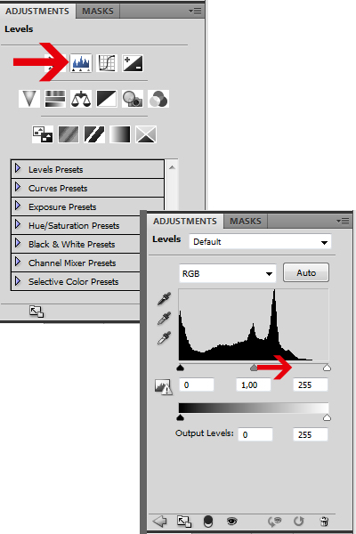
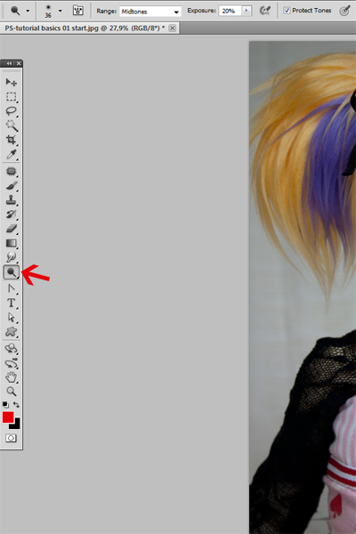
First I'll adjust the balance of light and dark using the Levels Adjustment layer. Click on the icon and then you can modify the levels of light by pulling at the black, grey and white triangles at the bottom of the figure. Usually just pulling the grey one to either side (just a centimeter can do the trick, sometimes even less!) is enough.
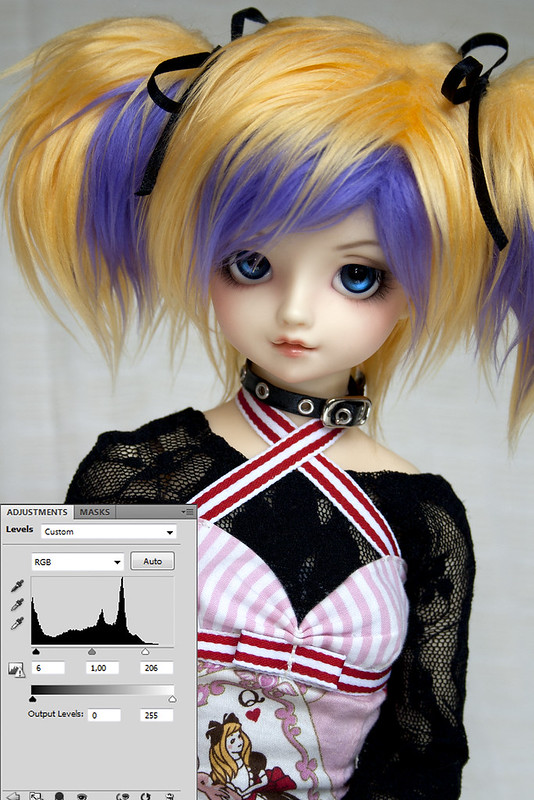
For this picture, I want to bring more light to it, so I pull the white triangle to the left just enough so that none of the lightest areas of the picture (the cheec and the hair) are burnt out. Then I drag the black triangle to the right ever so slightly to make the black eyelashes even blacker. To not make the picture too dark, I then drag the grey triangle around to balance it to my liking.
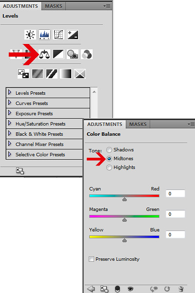
Then to fix some colouring issues. I often use Color Balance, although for some photos I get the achieved effect just by using a Gradient Adjustment layer (see below). You can fix colouring for all shadows, midtones and highlights separately. You might want to start with midtones, since that usually fixes everything by itself, like it did for this picture.
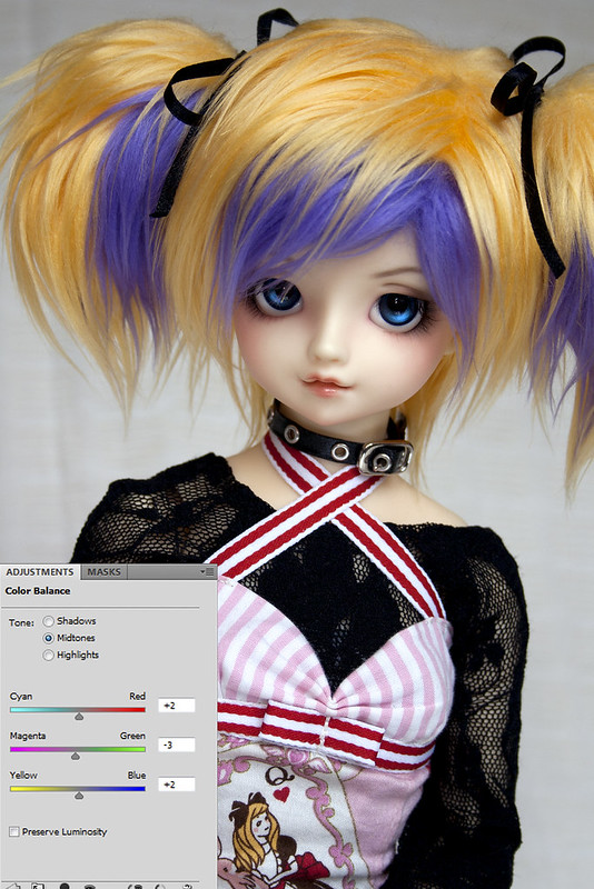
I want to get rid of the green, so I pull the magenta-green lever to the left (towards magenta). Green hues can also be because of yellow light, so I counter that by pulling the yellow-blue lever to the right (toward blue). I then also drag the cyan-red lever slightly towards the cyan, to make the colours more balanced. How you pull the levers is entirely up to you and your photo! Try different combinations, just do it with small adjustments at a time.
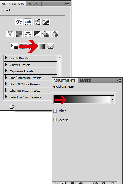
A good photo, but missing some oomph! If I have nothing else in mind, then I usually fall back on this handy quick way to get some of that into the photo. I use a Gradient Adjustment layer and choose a black to white solid gradient. You can change the gradient colours by clicking on the gradient bar and either choose one of the presets (b&w should be one of them by default) or choose your own colours. The bar shows that the shadows of the photo will be of the color on the left, fading into the colour on the right for the lightest areas of the photo. So a bar from black to white will actually make the photo, well, black and white. A gradient from green to pink would make shadows green and the highlights pink etc. But for this basic adjustment, let's just stick to b&w, shall we?
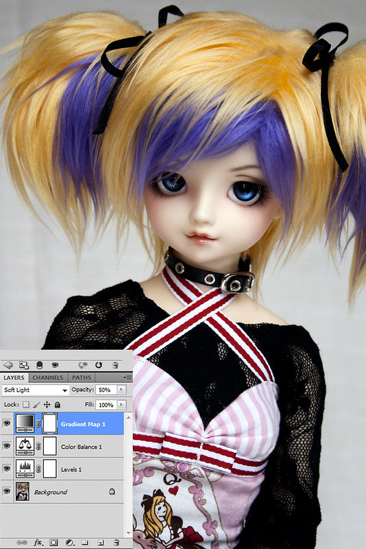
So making the gradient layer, your photo now looks like it black and white. I don't want that for this particular photo, so I need to adjust the gradient layer's blend mode. Click on the drop down menu on the top left corner of your layers palette and choose Soft Light. Instant oomph, right? Well, I don't really need that much of it (less is more and so forth), so let's tone it down a bit. Click on the Opacity lever on the top right corner of the layers palette and drag down the opacity of the gradient layer. You might want to drag the opacity all the way down to 0% at first and then gradually increase the opacity until you get the result you want. Play around and don't be afraid to look at something else at times, and then come back at the picture to see if the opacity level is still the right one (one comes 'blind' to the effects if you do these too quickly). You can also check to see how much of a difference the adjustment does to your photo by clicking at the layer visibility icon (the eye icon at the front of each layer) on and off. For this photo, I finally settled for 50% opacity.
And here is the end result!
I'll leave for other tutorials how I do the 'dreamy effect' I sometimes use and also the other uses I have for the Gradient Adjustment layers. Honestly, those thing can do miracles!
Anyway, I hope you at least enjoyed the tutorial, even if it didn't give you any new useful tools :P

Good tips, they'll come in handy! Thanks for adding the info on gradient adjustment, I've been wanting to try that out but never really understood how to use it correctly...
VastaaPoistaLooking forward to that "dreamy"-effect tutorial! ^3^
Gradient adjustment layers are very handy, but they are usually used in combination of a specific blending mode to suit it. I often use Soft Light, but occasionally Screen and Multiply are also used. Or sometimes just taking down the opacity. It's mostly about playing around with it to get the best results for each photo, but wih this series of tutorials I want to show some guidelines which I go by. Meaning the most used gradients and blends and what they actually do. I know when I looked at tutorials, I just copied the exact values and such that the tutorialist had used and then was depressed because the result wasn't the same... :P To use these to their best extent, one needs some basic knowledge what they do so that they can apply to their own photos. So that is something I try to underline in my tutorials. I dunno if I succeed or not, but you can always leave feedback in the comments :D
VastaaPoistaVery good tutorial, there was couple of things I wasn't familiar, this will come handy! x3
VastaaPoistaNo prob! If there is any particular adjustment that you weren't at all familiar with just let me know and maybe I can focus on those later on. Not knowing how much people generally know about Photoshop (not saying I am an expert of any kind myself), I might talk at length about things that make people go "I knew that already!" and then skip over the actually interesting parts...
VastaaPoista